Project Overview
The Challenge
Making the document editing experience in Aerodocs CMS frictionless and intuitive.
Potential adoption of the product in other verticals.
Potential adoption of the product in other verticals.
My Role
Lead Designer (member of the Product Core Team)
Contribution
User research, interaction flow diagram, low and high-fidelity prototyping, validation and feedback loop.
My Role
Lead Designer
__________
During my last year at Viasat, I led a project to explore the suitability of the Aerodocs platform outside Flight Operations, the area that it was initially designed for.
This project involved leasing with various stakeholders and coordinating with managers of different departments within Viasat responsible for areas such as Quality Assurance, Training, Technical Publications, IOS Certifications, etc, to research and understand their needs and assess Aerodocs in light of those needs.
As part of this effort, I worked with the team to conceptualise ways to improve known usability issues for our current and future users.
The Challenge
From a niche Project to Product
__________
Aerodocs is s cloud-based service, that allows airlines to create, manage, distribute and view their documentation in a collaborative, secure and controlled environment. It has been developed within the Commercial Aviation division of Viasat, with a strong focus on airlines’ needs.
For the past few years, the software development and life-cycle had been strongly influenced by Qatar Airways' needs and ways of working, as well as some technical limitations.
However, as the product matured, we believed there could be potential in other industries that have similar documentation/information requirements. Our next challenge was to slow down and look up to the future of Aerodocs as a product that we could take to other markets.
Through interviews and observation sessions with existing users, we identified friction in the usability of the product that could present a significant barrier to entry to other markets. Our goal was to improve on this while we continued our process of research and exploration of the possibilities ahead.
Discovery
Editing is still too technical and unintuitive
__________
User testing with both external and internal users, showed us that the editing experience was not ideal. Key findings:
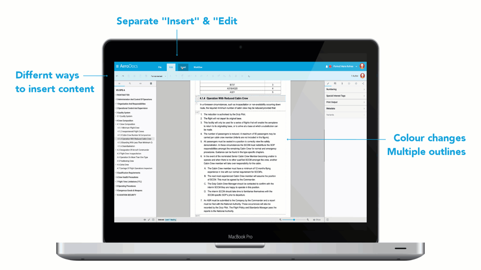
1. Having 2 separate menus for ‘Insert’ and ‘Edit’ was time-consuming and frustrating.
2. The distinction between inserting content into the Table of Contents versus any other type of content (paragraphs, tables, lists…) didn’t match author’s mental models.
3. Changes in colour and display of outlines around the text, makes it feel too technical and adds usability barriers.
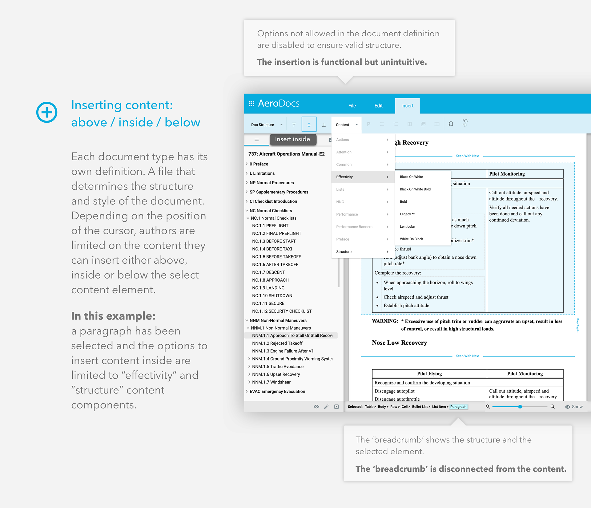
4. Also, the ability to edit Boeing original manuals, while a huge achievement, presented big challenges. The complexity of the documents meant we needed to add new content types (eg. Non-normal procedures, challenge responses, action items…). We needed to design the product so that we’d help the authors ‘do the right thing’ and maintain a valid XML structure without any need to understand XML.
5. Authors of Boeing documents needed to know what kind of content they could or could not insert and where.
Our first implementation was functionally successful and helped us test and validate this feature, but the user experience was complex and unintuitive.
Ideation
Focus on author’s mental models and contextual actions
__________
We focused on simplicity.
Aiming for a smoother, faster and more intuitive experience, while still keeping a valid XML structure behind the scenes.
Aiming for a smoother, faster and more intuitive experience, while still keeping a valid XML structure behind the scenes.
Technical constraints had led to some of the drawbacks that were frustrating authors, but we knew from competitor research that Aerodocs' ease of use was one of our key competitive advantages and therefore it was worth investing the effort to improve it. This effort aligned with our long-term vision to bring Aerodocs to other markets outside Flight Ops and Aviation.
We focused on 2 areas, inserting and editing content:
• Aiming for a cleaner and clearer user interface.
• Anticipating users' actions and improving signifiers across the app by using guidance text, thumbnails, examples and descriptions, etc.
• Options to use keyboard shortcuts and fewer mouse clicks.
• Removing some of the existing barriers caused by technical constraints.
• Keeping actions and information contextual.
• Assisting authors when editing complex manufacturer documents.
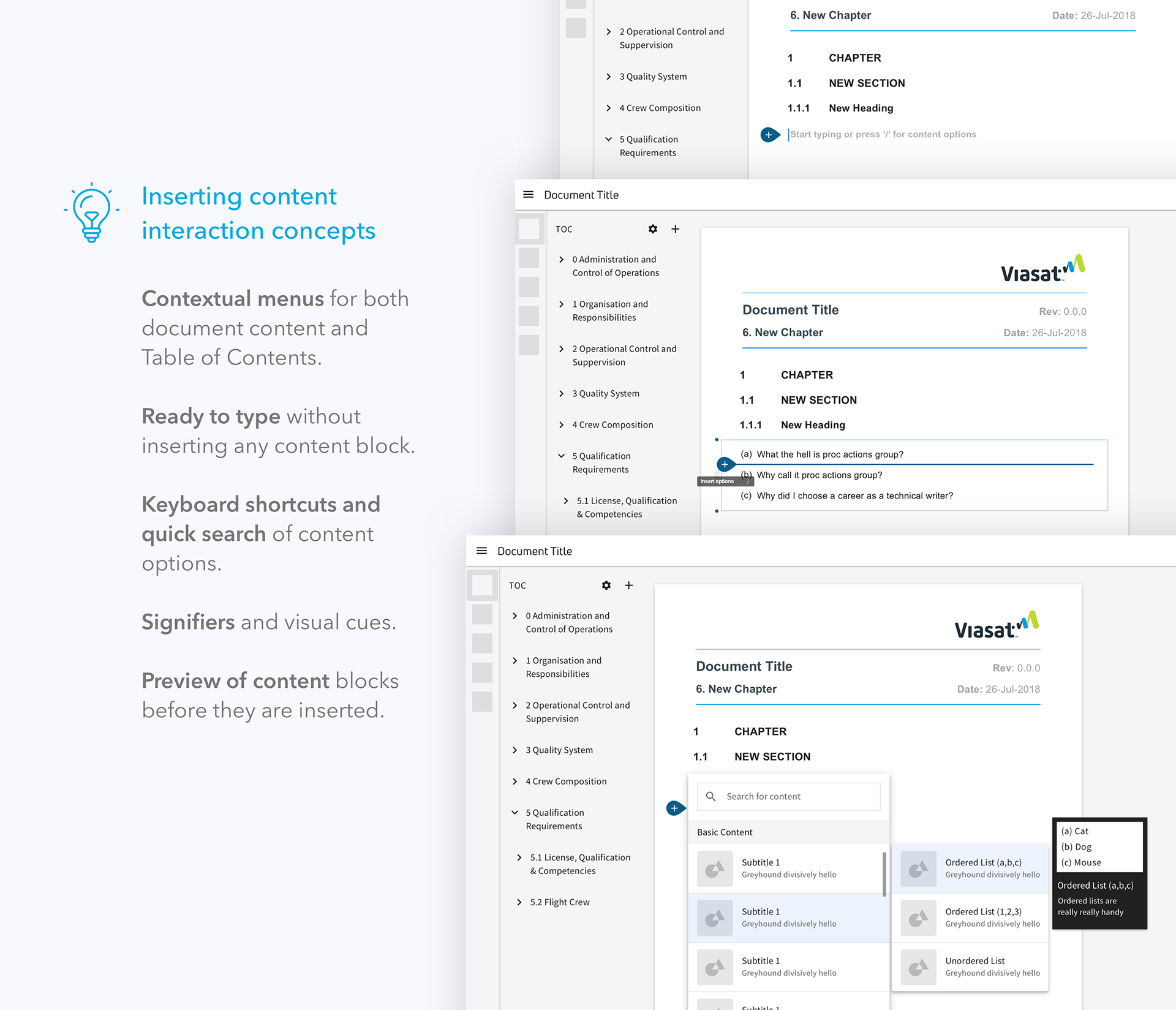
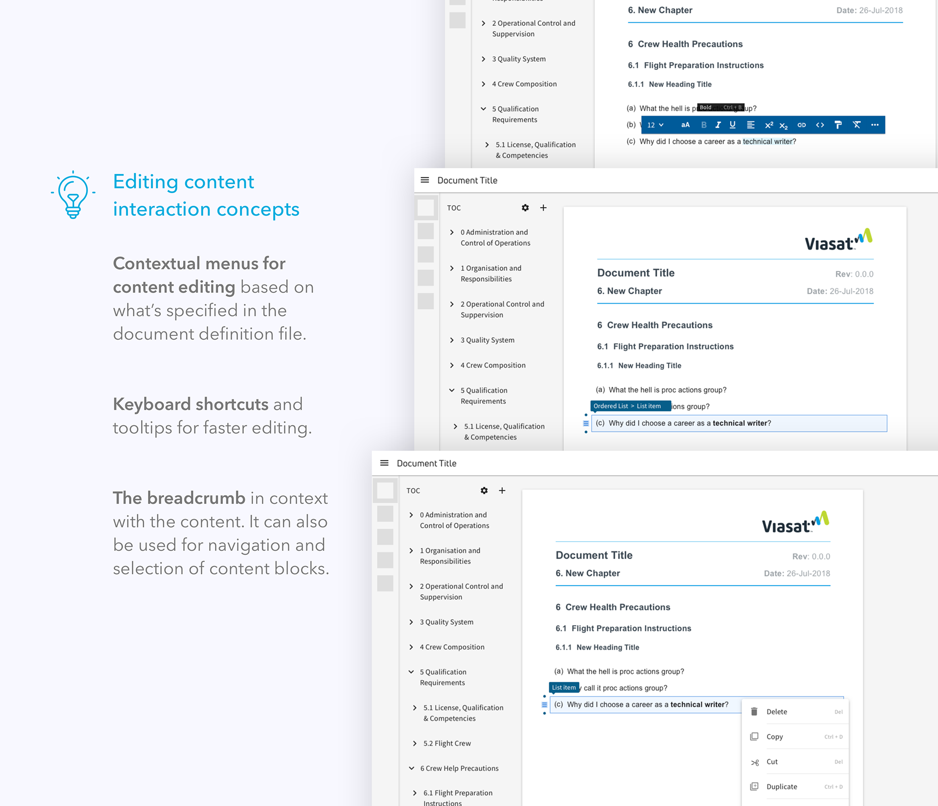
Contextual menus allowed us to remove the division between the "Insert" and "Edit" menus, that were causing confusion and slowing down the editing experience.
Prototyping
Cleaner UI and contextual options
__________
The following prototypes show how content insertion for the Table of Contents and the document is contextual. Tools are available just when the user needs them, allowing for a cleaner and clearer interface, a smoother and more intuitive experience, and freeing up valuable real estate.
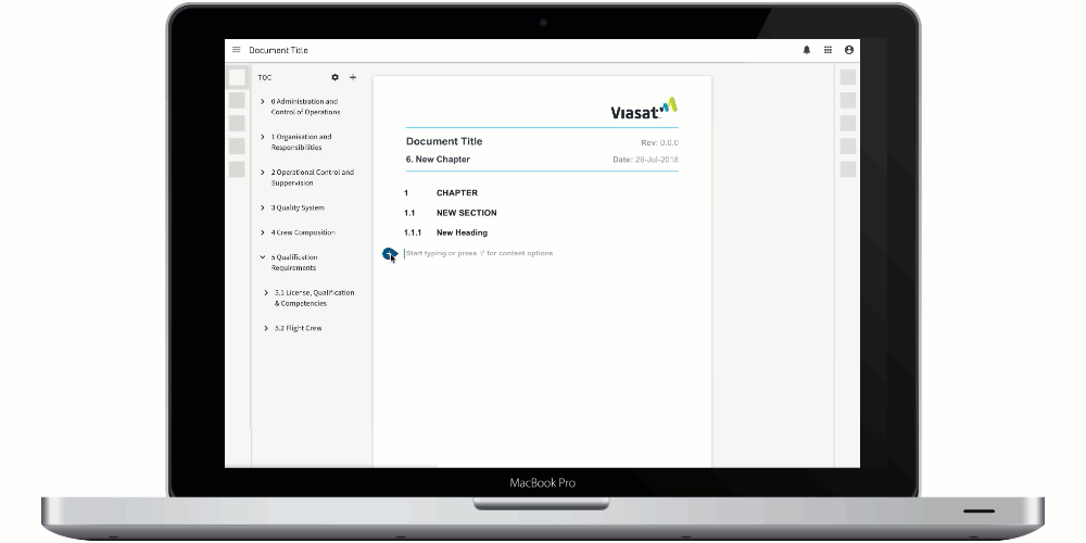
Inserting content in the document
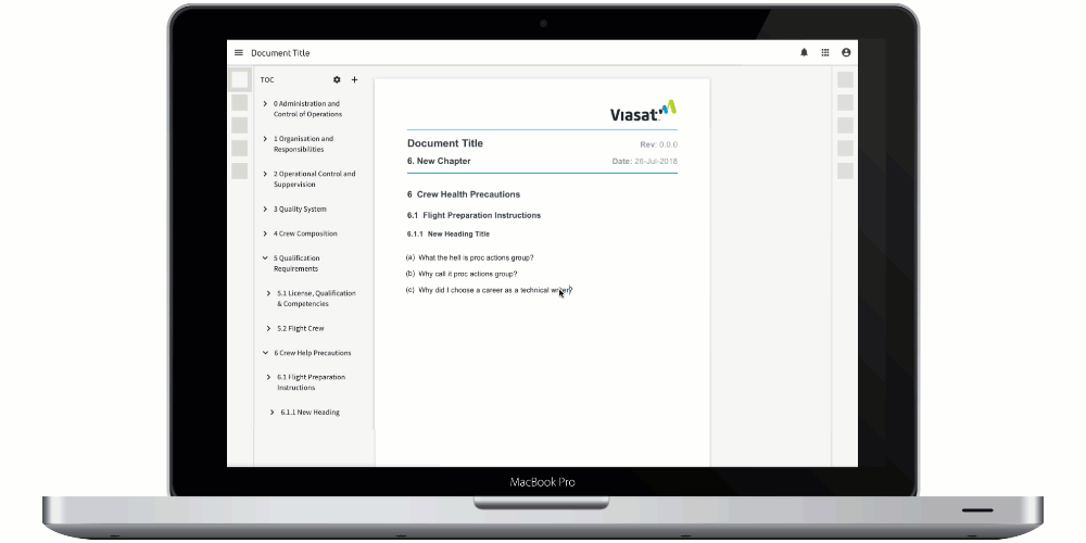
Editing content in the document
More on Aerodocs
Detailed examples of Aerodocs design work
__________